Portfolio | Strategic Design – Naay
DREAM OF BEAUTY.
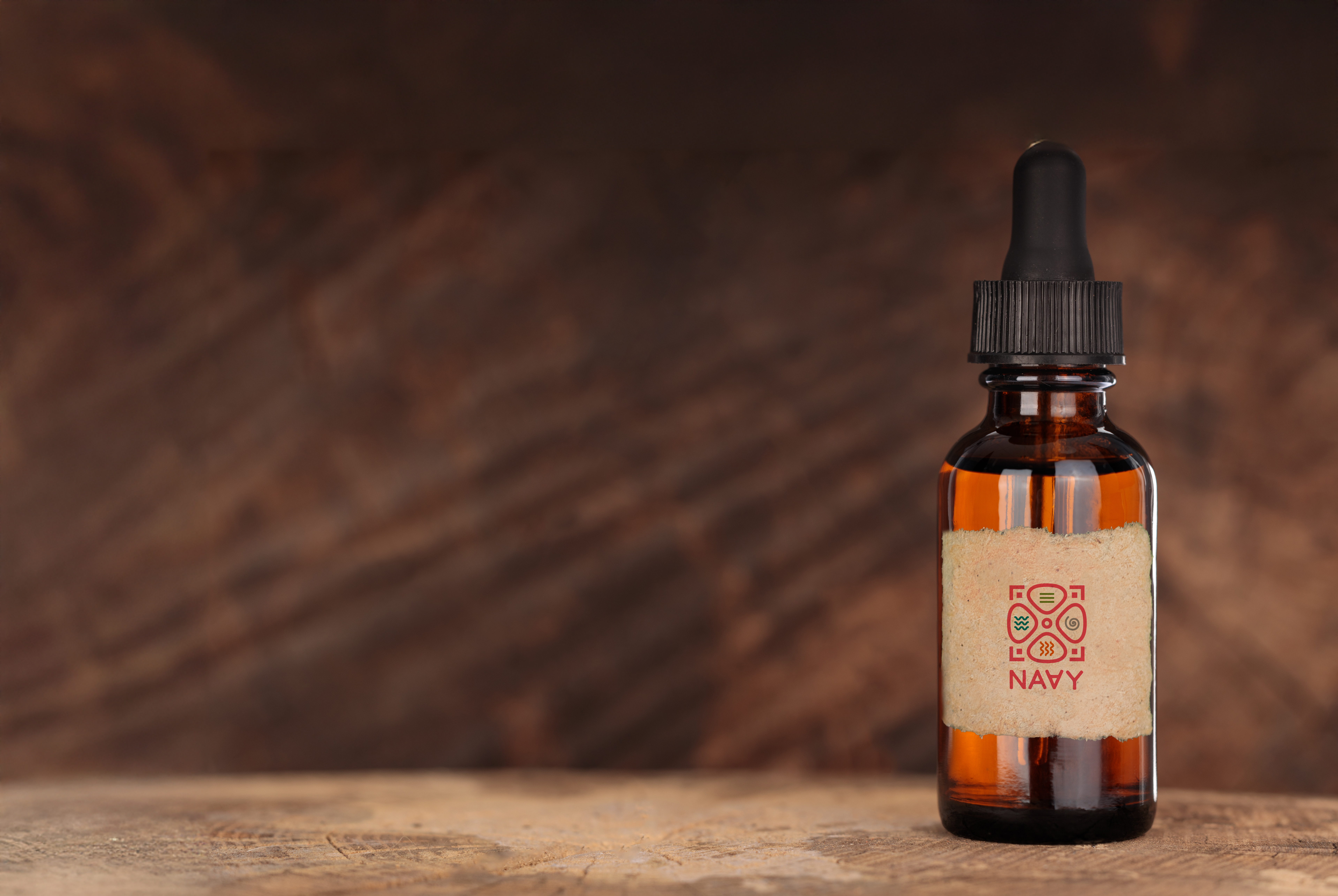
Branding / Logo Design | October 2024
PROJECT SUMMARY
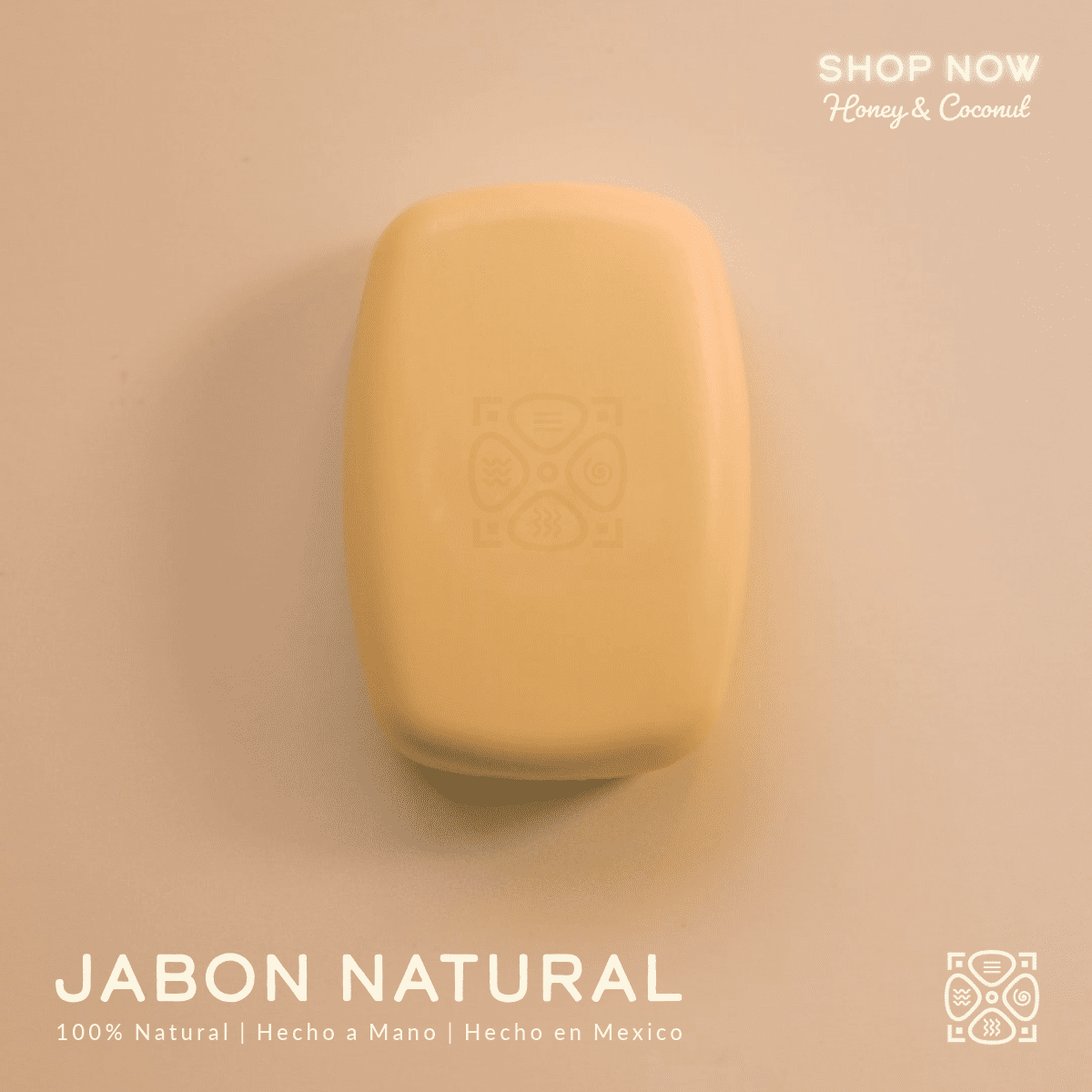
Naay—derived from the Mayan word for “dream”—is a Mexican skincare brand rooted in the ancient herbal wisdom of pre-Hispanic civilizations. Naay offers handcrafted, natural products that prioritize sustainability, wellness, and the heritage of indigenous healing practices.
The rebranding project focused on transforming Naay into a modern, memorable, and mission-aligned brand, redefining its visual identity and storytelling to resonate deeply with conscious consumers seeking holistic, ethical skincare solutions.
MY ROLE
- Brand Strategy
- Logo & Visual Identity Design
- PR Positioning & Story Development
- Brand Guidelines & Application
CREATIVE DIRECTION & GOALS
Naay was ready to grow from a beloved local skincare line into a lifestyle brand with broader cultural resonance. My goal was to elevate the brand’s presence while staying true to its roots. This meant building a compelling narrative around its heritage, creating a design system that expressed authenticity and sophistication, and preparing the brand to stand confidently in a competitive, values-driven marketplace.
Key Objectives:
- Reimagine the logo while honouring the original symbolism.
- Develop a cohesive and professional brand identity system.
- Craft a meaningful brand story that connects with eco-conscious, mindful consumers.
- Position Naay as a premium, ethical skincare brand rooted in tradition and innovation.
- Create flexible brand assets for both digital and print applications.
DELIVERABLES
- Logo Suite: Full primary logo, secondary marks, and icon system
- Color & Typography Systems: Harmonized for digital and print use
- Comprehensive Brand Guidelines: Usage rules, visual examples, and tone of voice standards
- Brand Story & Messaging Framework: PR-driven storytelling with cultural context
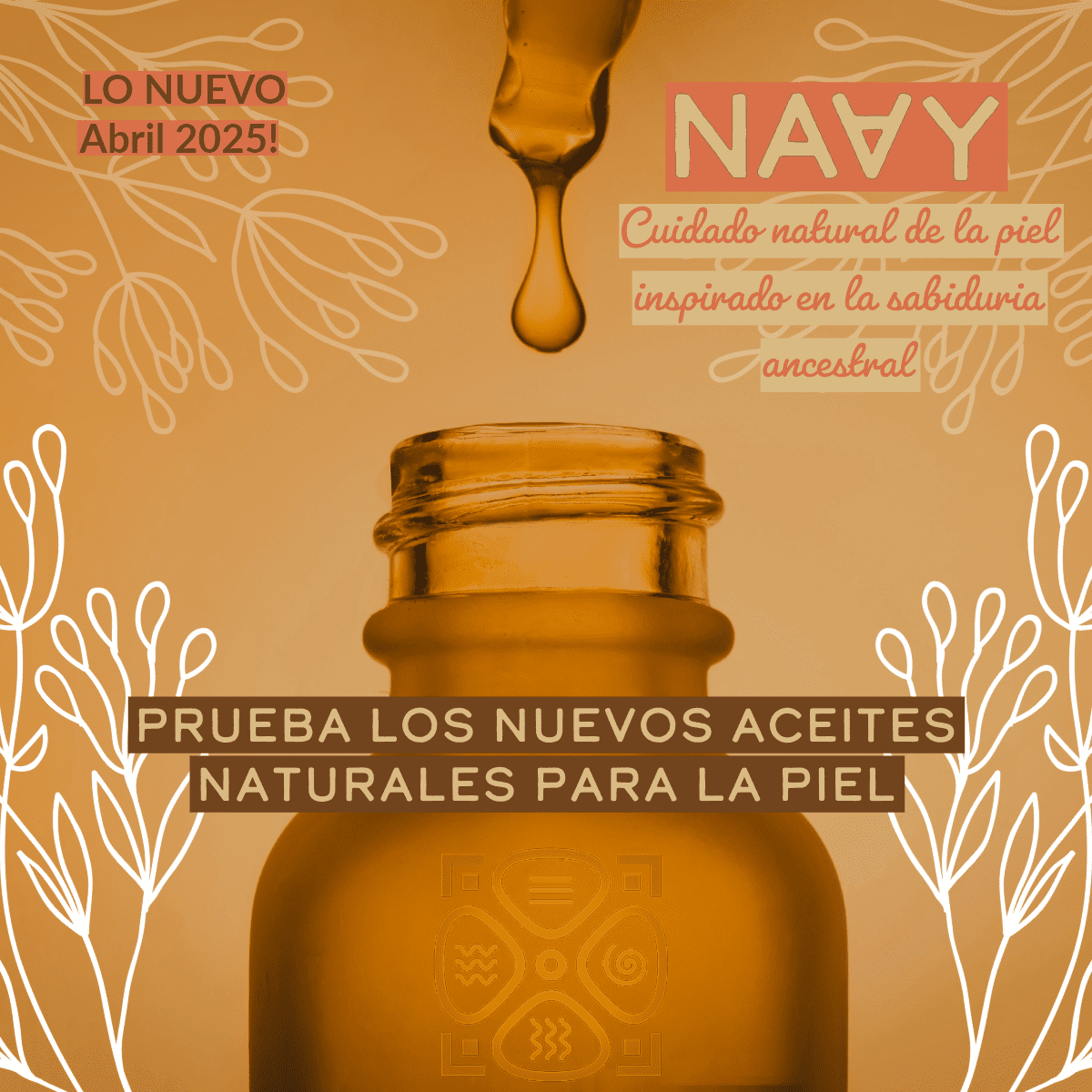
- Social-ready Design Elements: For visual cohesion on digital platforms
DESIGN APPROACH

BEFORE & AFTER
VISUAL IDENTITY
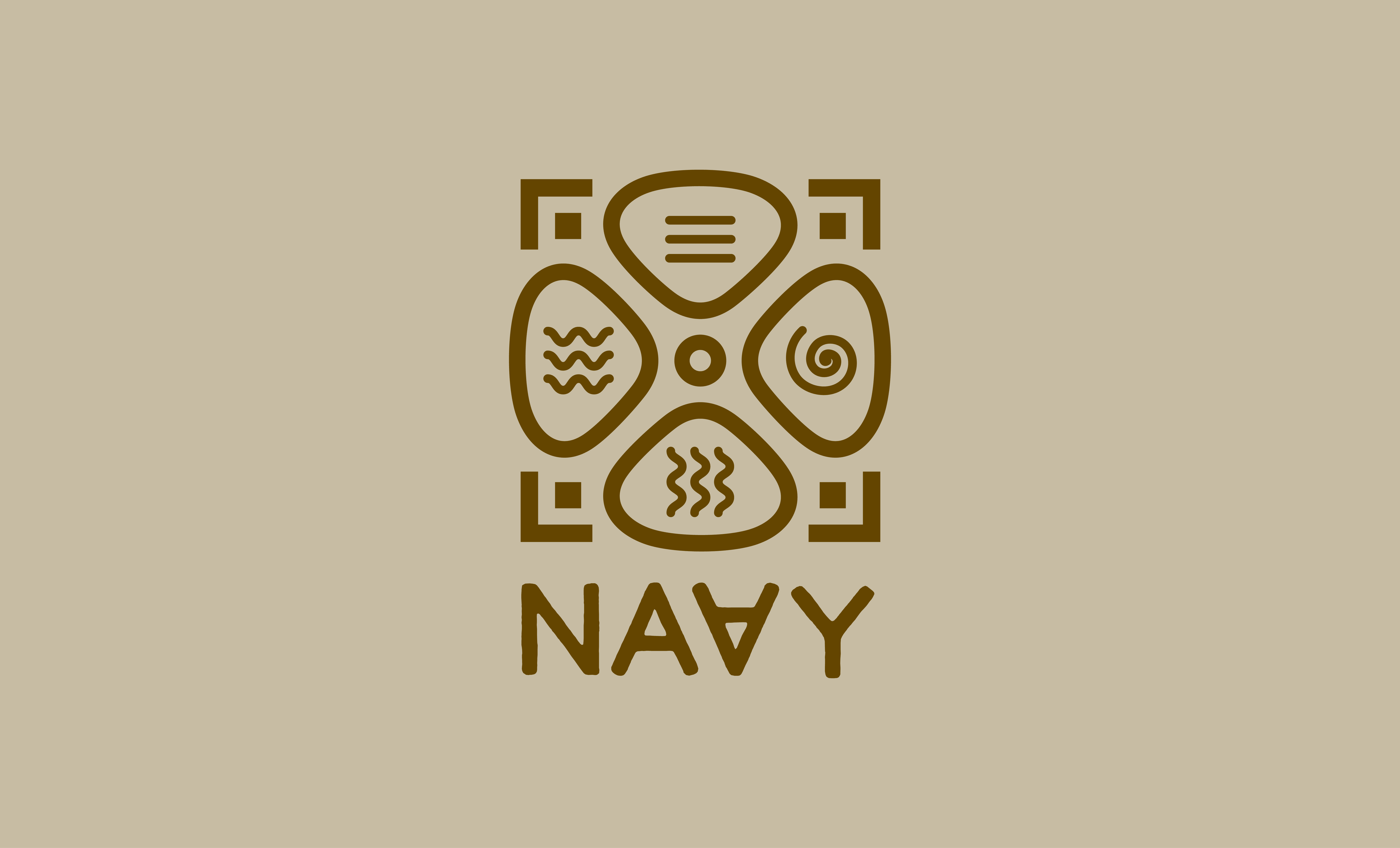
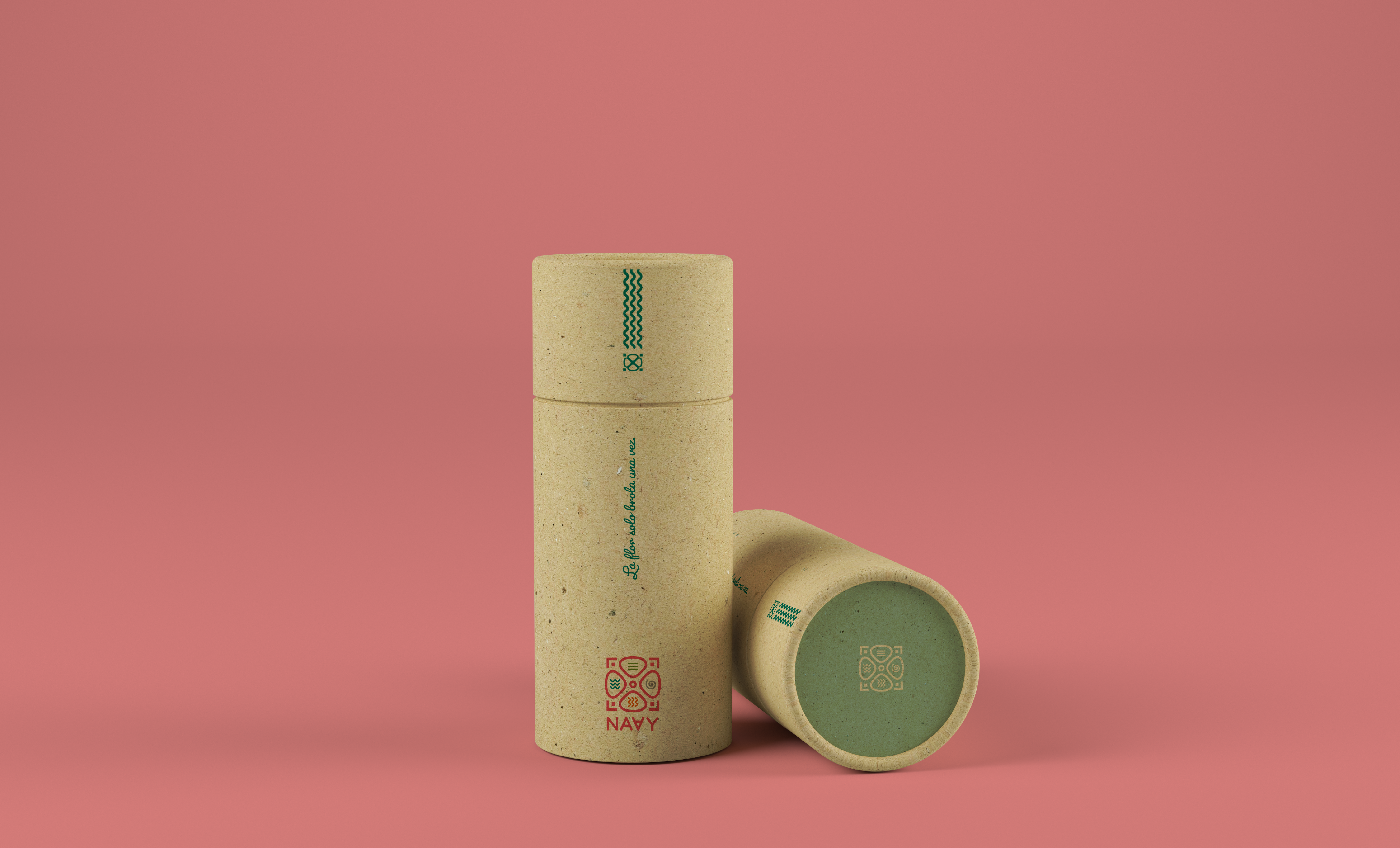
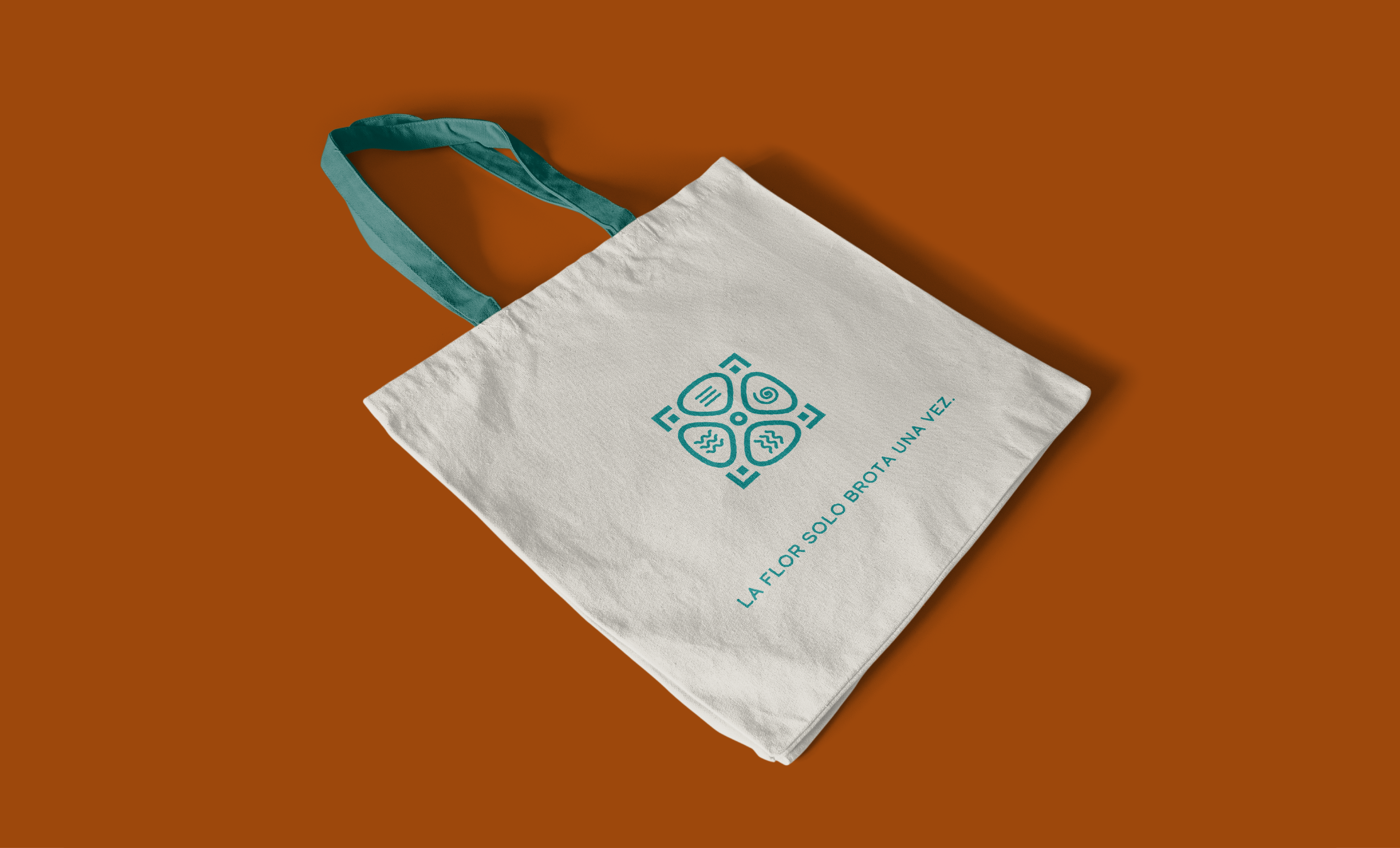
Logo Evolution
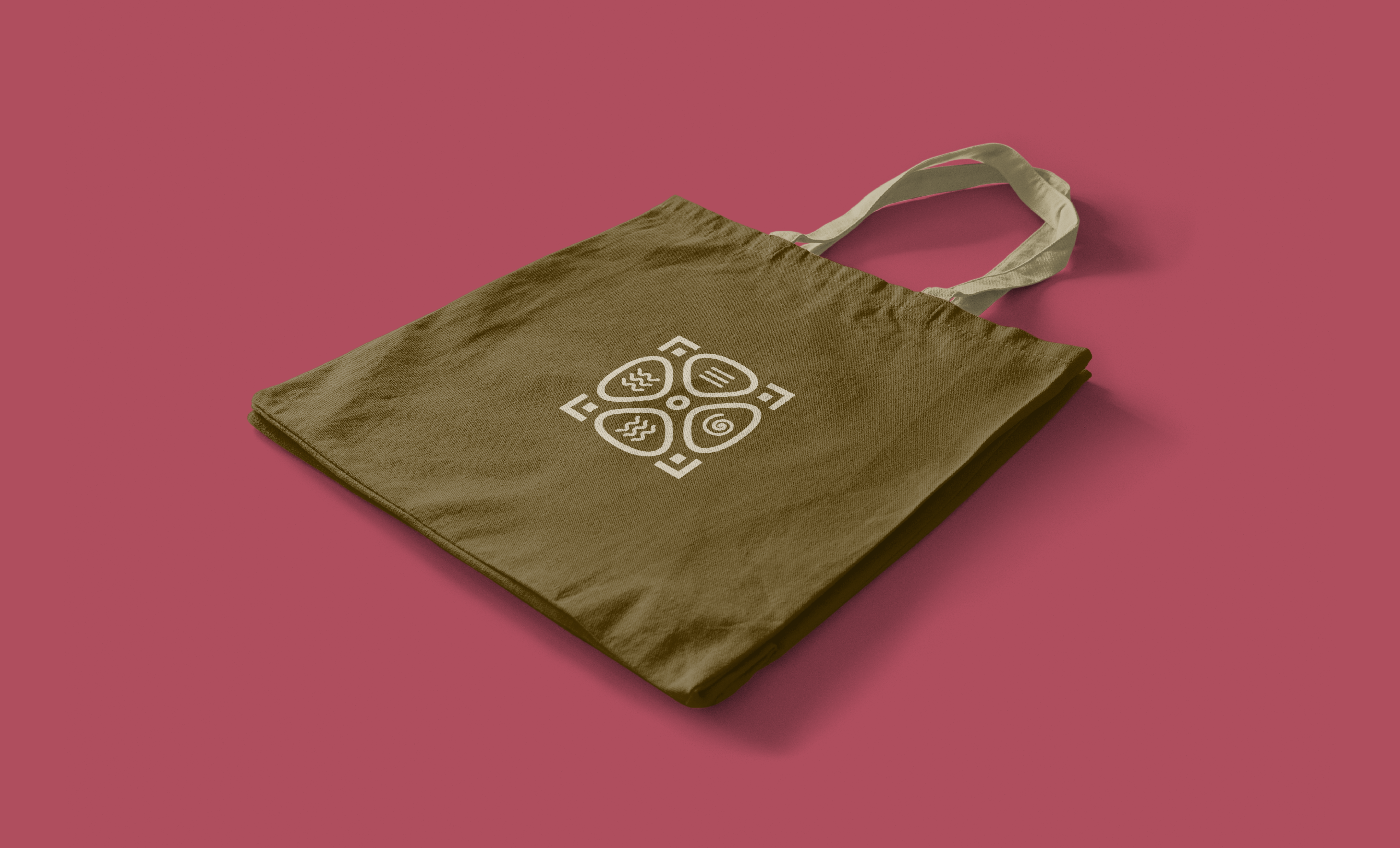
- Before: The original logo depicted a pre-Hispanic four-petal flower symbolizing the elements, but lacked professional refinement.
- After: I modernized the symbol using geometric precision while preserving its cultural essence. The result is a harmonious emblem that reflects balance, beauty, and heritage.
Logo Concept Highlights:
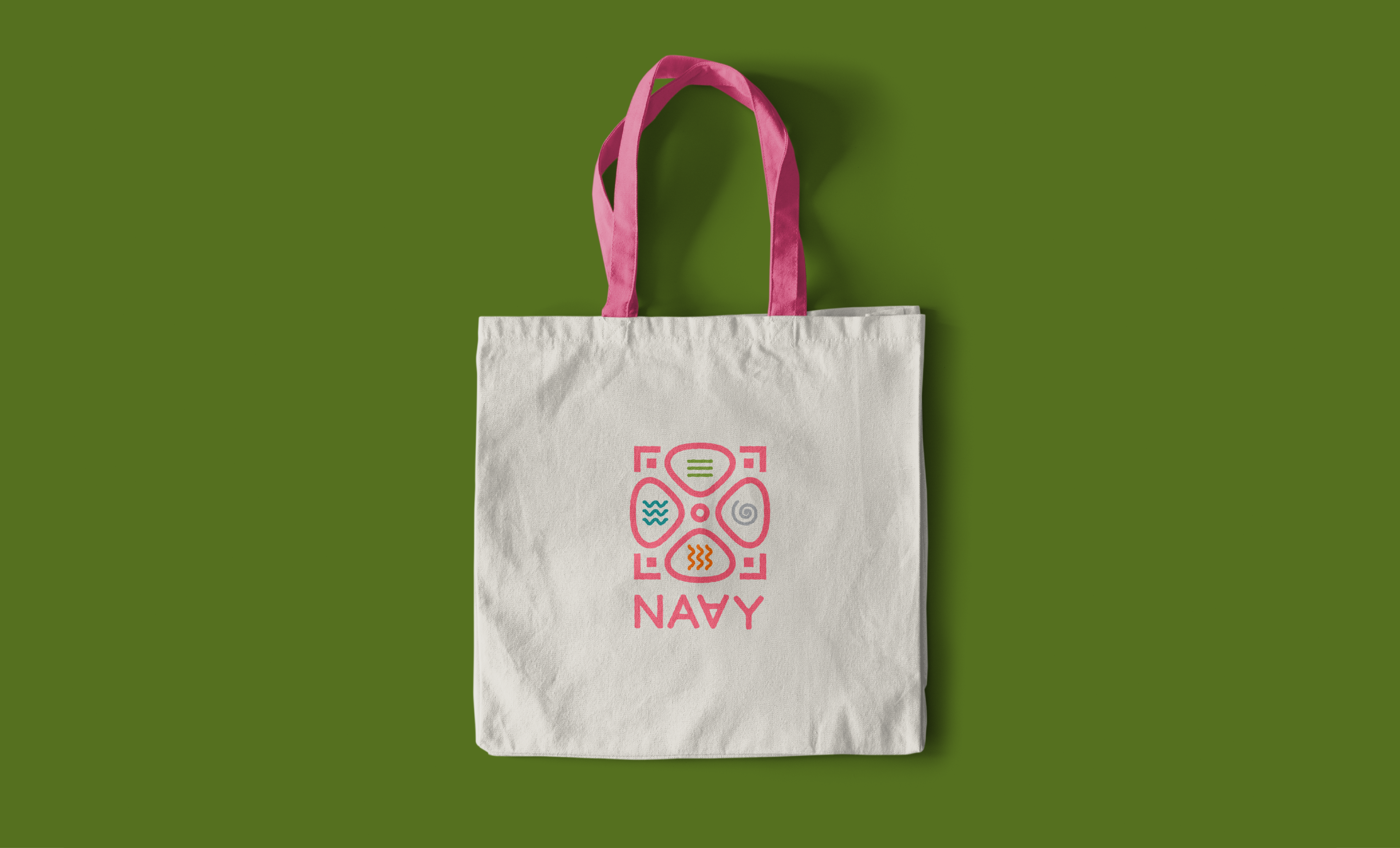
- Central four-petal flower = cardinal directions + natural elements (earth, water, fire, air).
- Clean geometric framing = structure, clarity, and brand maturity.
- Inverted “A” in NAAY = subtle nod to alchemical symbols for each element—layered meaning without sacrificing elegance.
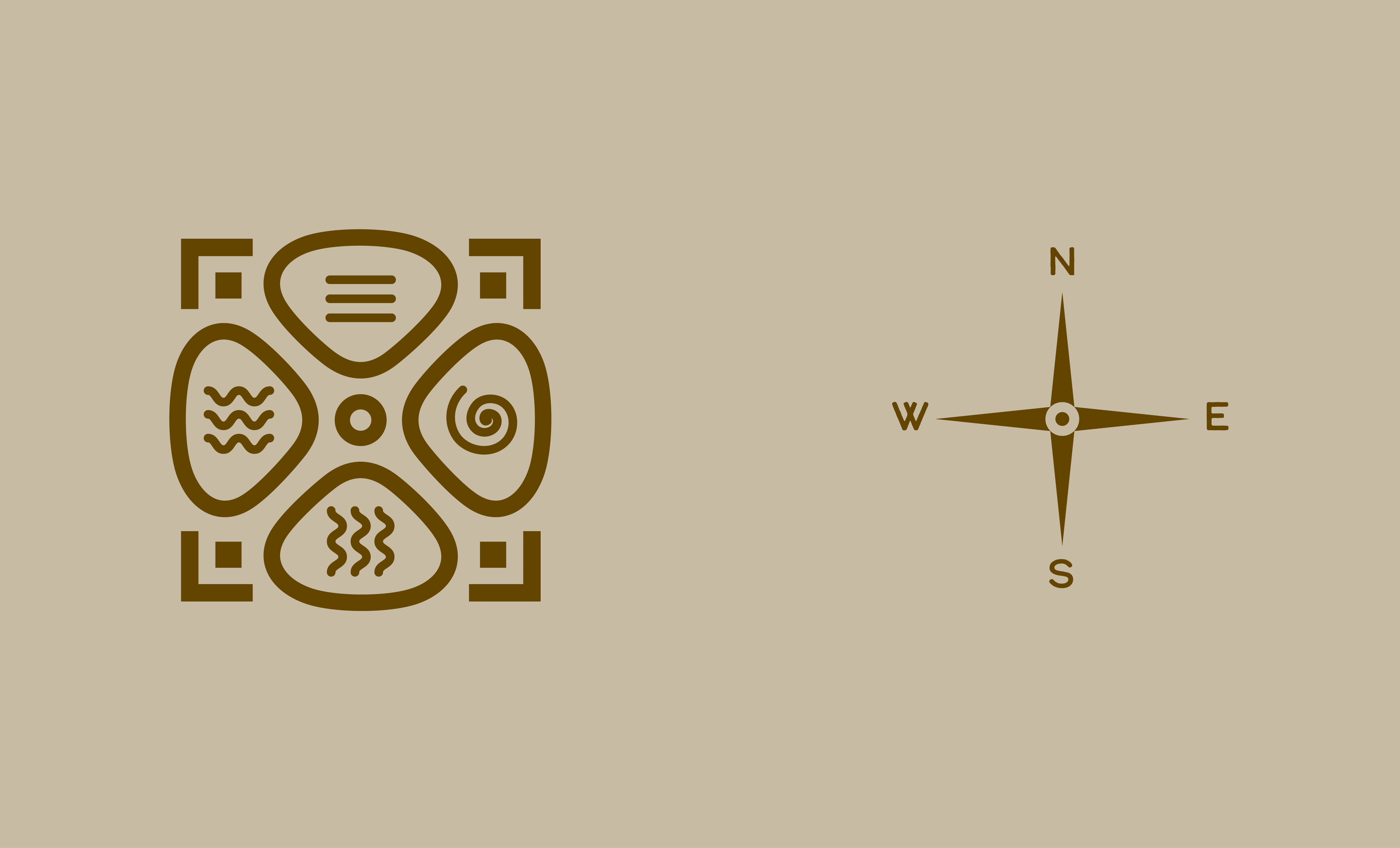
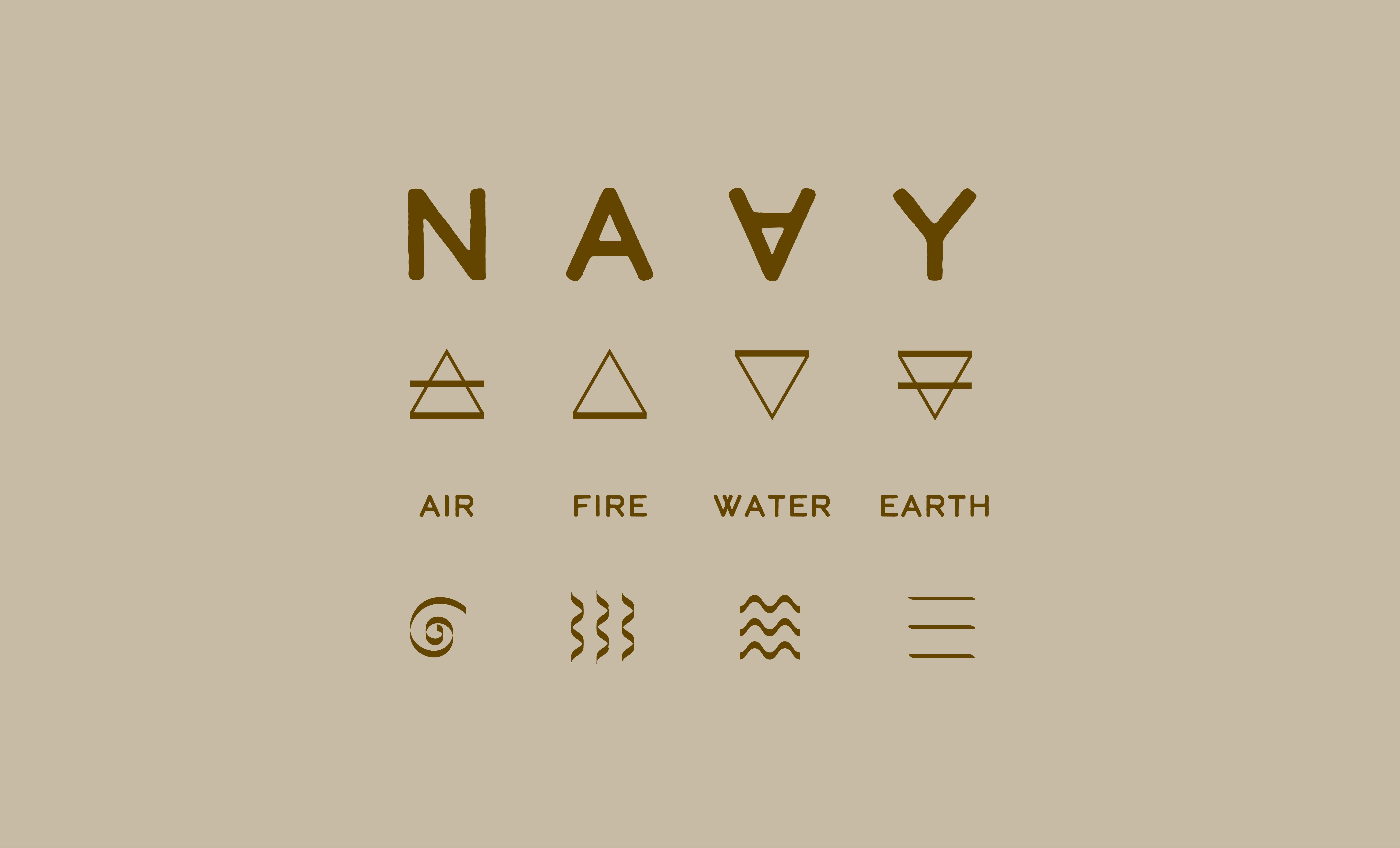
VISUAL ELEMENTS:
Central Flower: A stylized, four-petal flower will serve as the logo’s centrepiece, representing Naay’s connection to pre-Hispanic herbal knowledge. The four-petal flower represents the four cardinal directions and their respective elements (earth, wind, fire, and water) and their interconnectedness, symbolizing the natural harmony and balance of Naay’s skincare products.
Geometric Frame: A clean, geometric frame will surround the flower, symbolizing structure, organization, and stability. The frame represents the stability, dynamism, and innovation associated with the brand.
The inverted “A” in the Naay logotype: The brand’s name, NAA,Y with an inverted “A” is subtly designed to resemble the alchemical symbols of the four elements:
- Earth: A downward-pointing triangle with a horizontal line.
- Water: A downward-pointing triangle.
- Air: An upward-pointing triangle with a horizontal line.
- Fire: An upward-pointing triangle.
COLOUR PALETTE
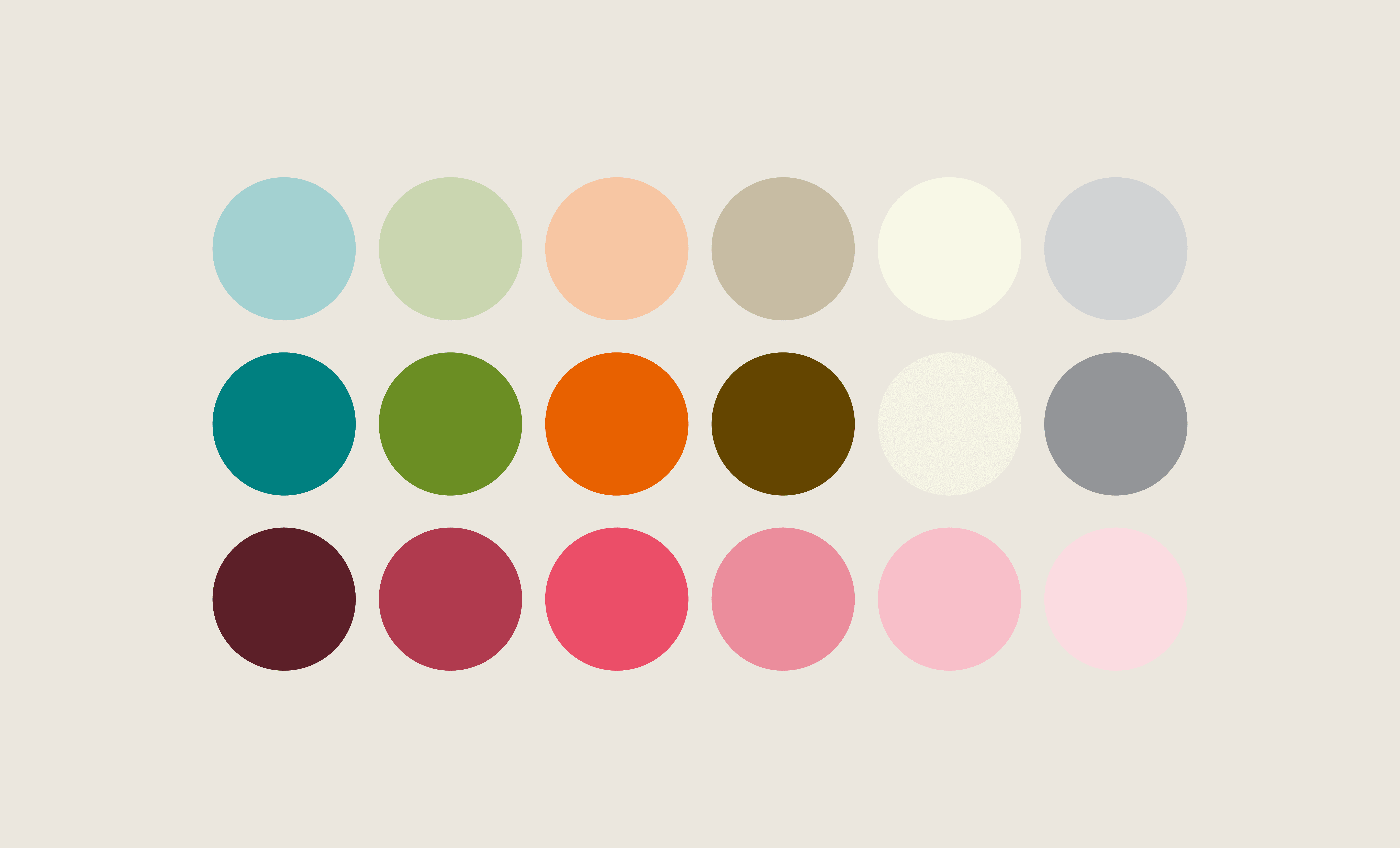
Inspired by earth and ancestral tradition, I designed an analogous colour scheme to convey warmth, vitality, and authenticity.
Key Tones:
- Aqua – Freshness, purity
- Green – Growth, harmony
- Orange – Energy, creativity
- Beige – Warmth, comfort
- Brown – Earthiness, grounding
- Pink – Femininity, nourishment
- Gray – Balance, stability
The palette ensures emotional resonance and visual continuity across touchpoints.
TYPOGRAPHY SYSTEM
A balanced, scalable type hierarchy blends elegance with readability:
- Primary – Calder: Modern and sophisticated, perfect for headers and the logotype.
- Secondary – Pacifico: Handwritten warmth adds personal and human touches.
- Tertiary – Lato: Clean and versatile, ideal for digital body copy.
The result is a typographic system that speaks to both the brand’s artisanal nature and its contemporary aspirations.
BRAND STORY & POSITIONING
“La flor solo brota una vez” – The flower only blooms once.
This phrase became a poetic anchor for Naay’s repositioning. I centred the rebrand around themes of transformation, ritual, and reconnection—honouring ancestral beauty rituals while championing modern self-care.
Core Brand Values:
- Authenticity: Rooted in real, natural ingredients and traditional practices.
- Sustainability: Respect for the environment and ethical sourcing.
- Effectiveness: Results-driven formulations grounded in nature.
- Heritage: A proud tribute to pre-Hispanic healing wisdom.
IMPACT
The new brand identity empowers Naay to expand confidently into new markets while staying deeply connected to its origins. With a more elevated presence, Naay now appeals to a growing community of intentional consumers who seek effective and meaningful skincare.
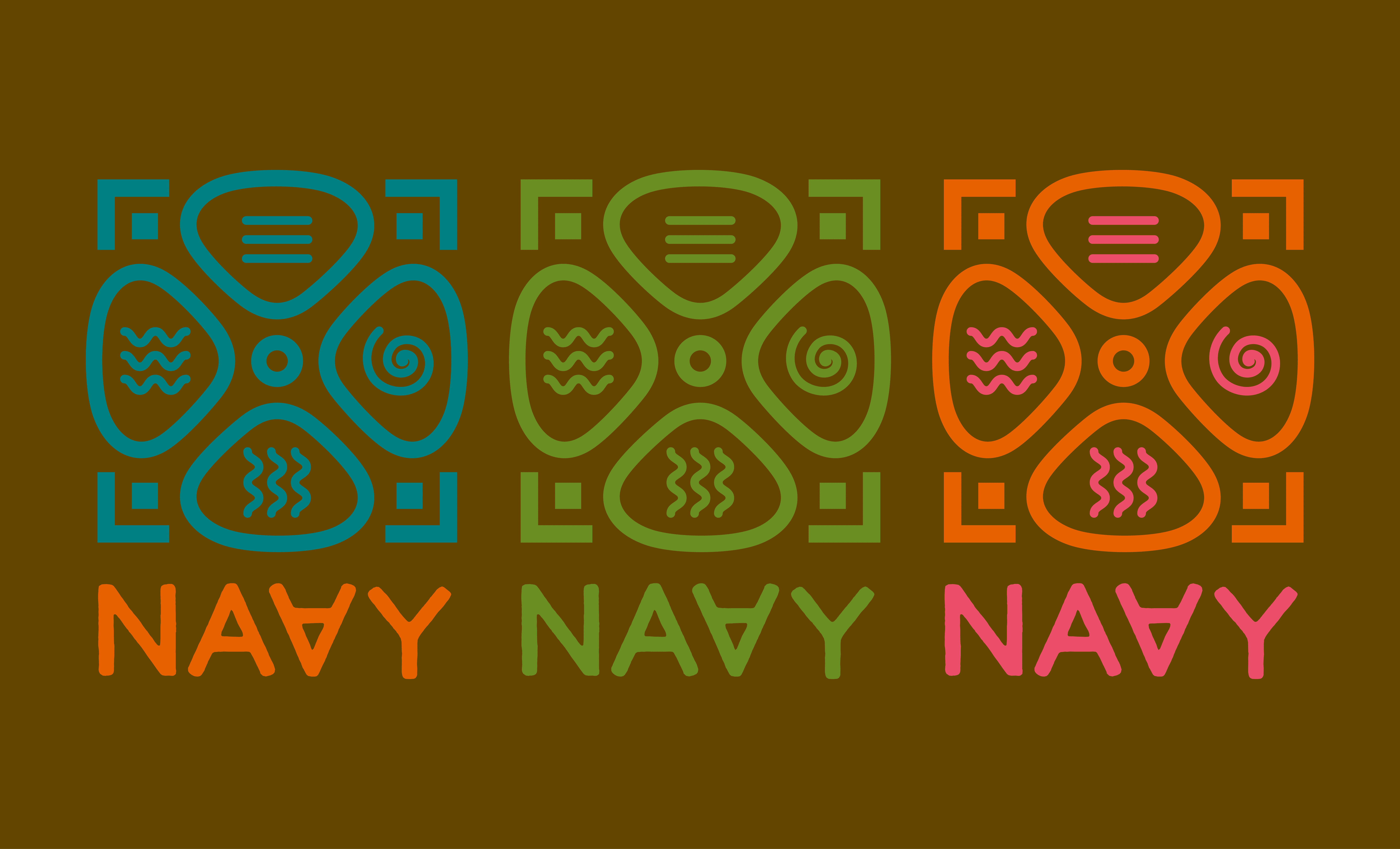
LOGO USAGE SAMPLES
EXTRA ELEMENT FOR DECO