Portfolio | Design + Communication – Project: Enjoitech Solutions Inc.
STRATEGIC BRAND REDESIGN
Branding | January 2025
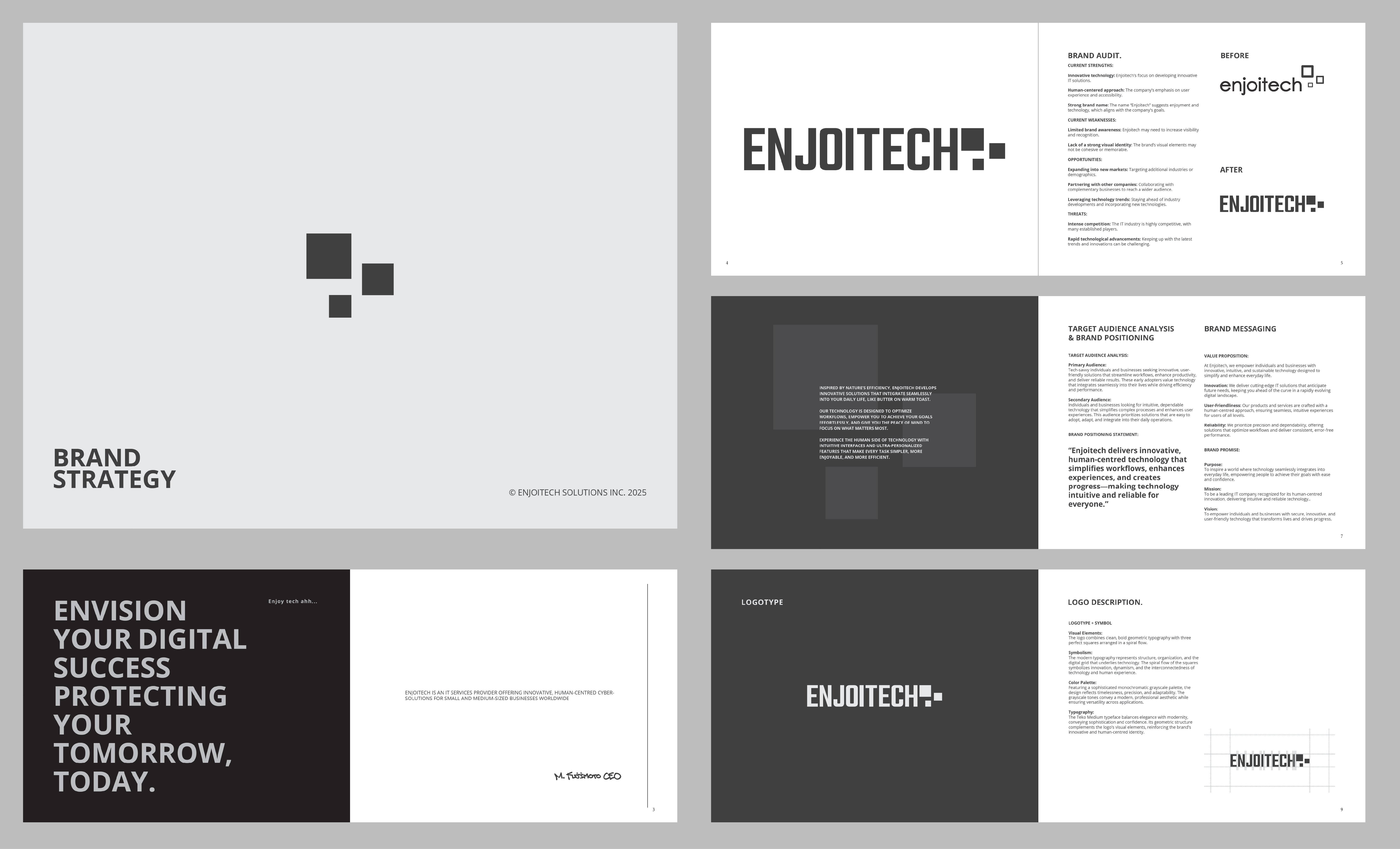
BEFORE & AFTER
From impersonal tech branding to a human-centered identity—designed to build trust and recognition.
STRATEGIC DESIGN CHALLENGE
How might we reposition a tech company to stand out in a crowded market by blending human-centered design with PR-driven storytelling?
CLIENT OVERVIEW (PR-FOCUSED POSITIONING)
Enjoitech Solutions Inc. is an innovative tech company providing intuitive, user-friendly solutions across the real estate, travel, and finance sectors. Despite its technological strength, Enjoitech’s original branding lacked emotional resonance and clear differentiation.
Challenges:
- Weak emotional connection with target audiences.
- Inconsistent and unclear brand storytelling.
- Impersonal visual identity misaligned with their human-centered approach.
→ This required more than a visual update; it needed strategic integration of PR and marketing objectives—credibility, memorability, and audience trust.
MY ROLE & STRATEGIC CONTRIBUTIONS
I executed the end-to-end rebranding effort, strategically aligning visual aesthetics with PR-driven messaging:
- Audience & Market Research: Conducted detailed analysis to identify audience perceptions, market gaps, and opportunities for strategic positioning.
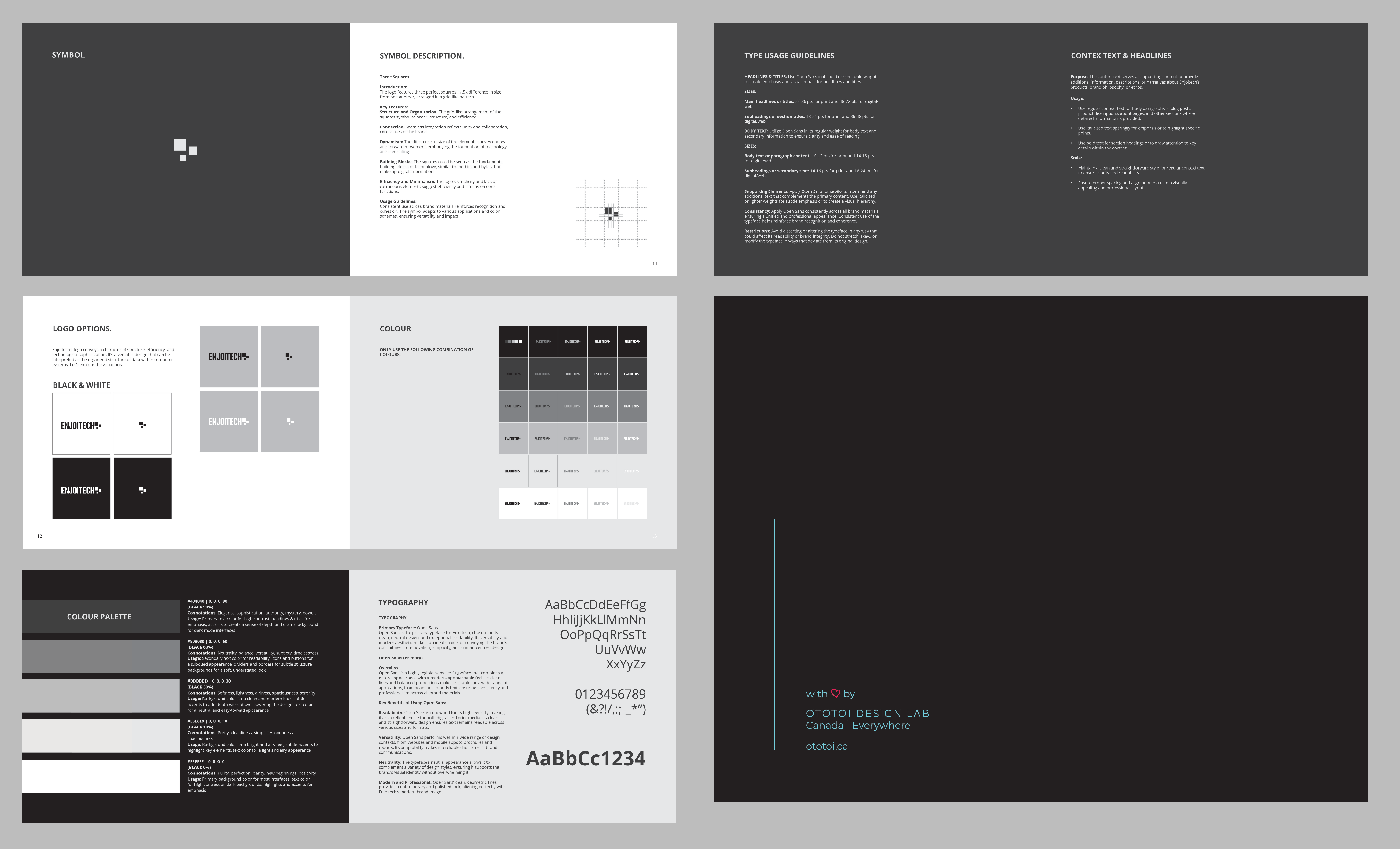
- PR-Infused Brand Identity: Developed a timeless monochrome visual identity to reinforce trust, reliability, and innovation.
- Conversion-Focused Web Design: Redesigned the website architecture around marketing funnels, SEO-optimized content, and strategic storytelling to drive conversions.
Key Deliverables:
- Brand strategy (USP, messaging architecture)
- Visual identity (logo, typography, monochromatic system)
- Marketing-ready assets (website, social templates, brand guidelines)
STRATEGIC DESIGN DECISIONS & PR/MARKETING RATIONALE
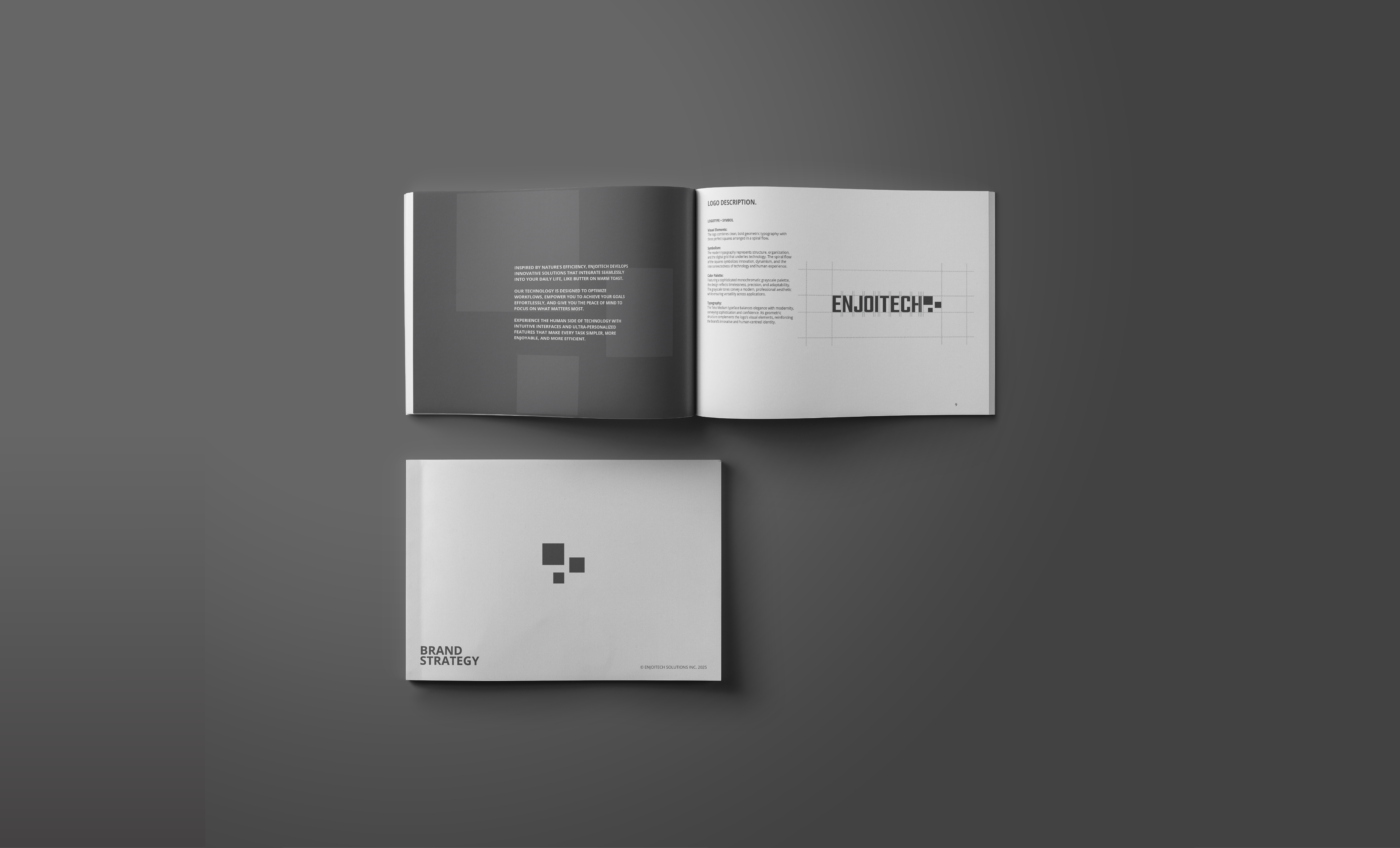
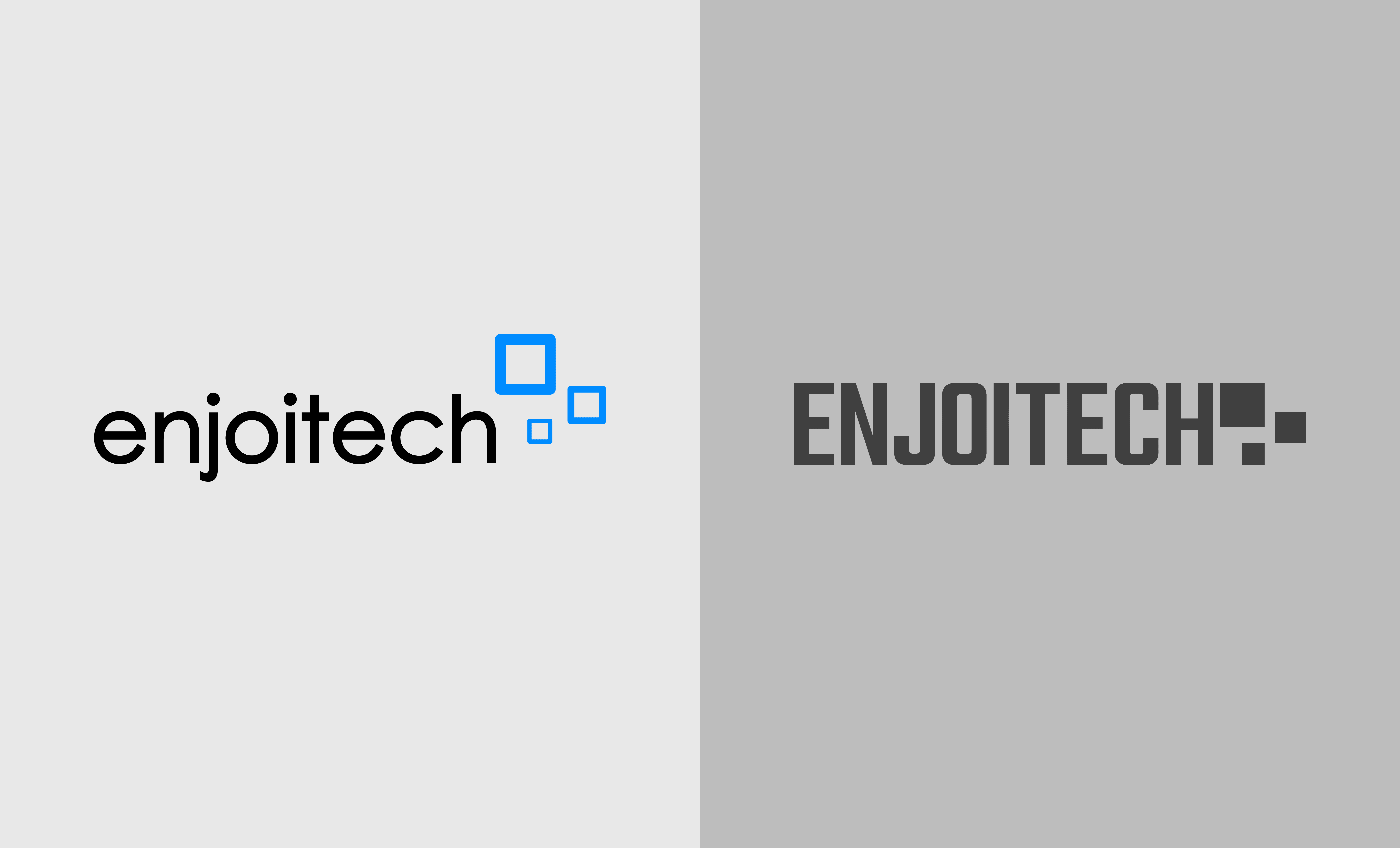
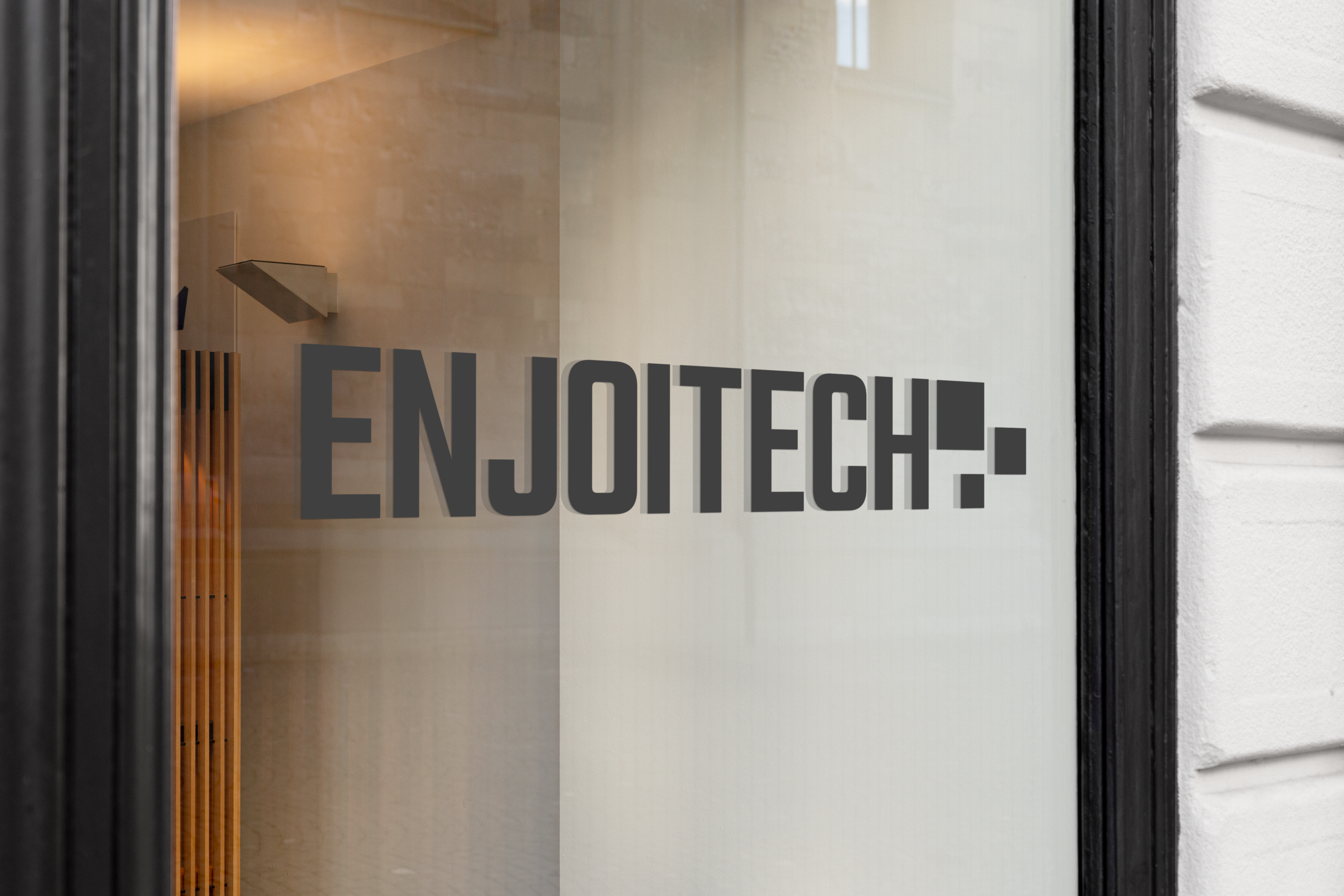
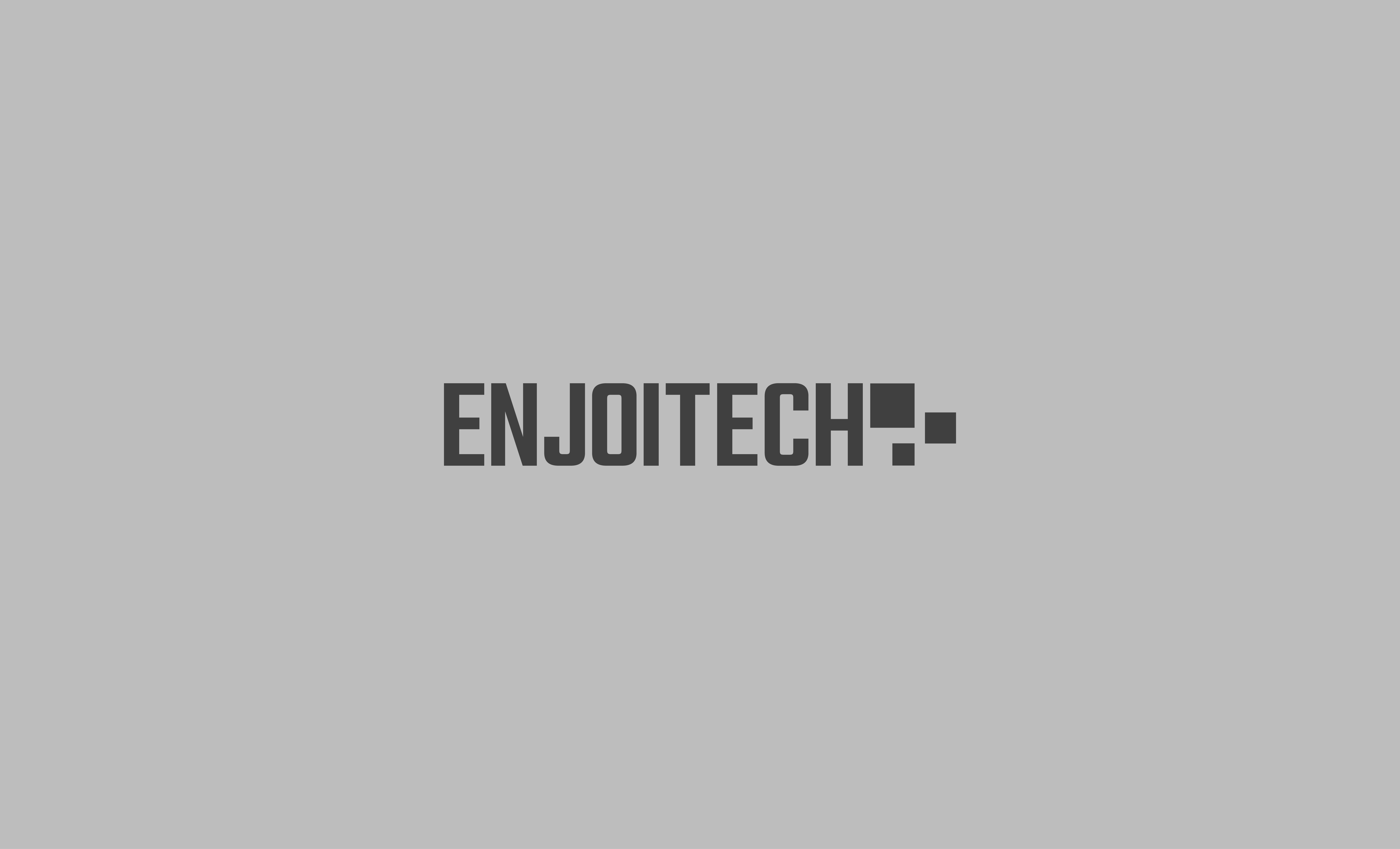
Logo Transformation (Visual Trust)
- Old Logo: Blue and geometric; professional but impersonal.
- New Logo: Monochrome grayscale; conveys reliability and adaptability.
- PR Impact: Timeless, authoritative presence.
- Marketing Benefit: Enhances clarity, readability, and distinctiveness.
Typography (Strategic Clarity)
- Chosen Typeface: Open Sans
- PR Rationale: Combines modernity with approachability, enhancing trust.
- UX Impact: Optimized readability for enhanced user engagement and conversions.

RESULTS & STRATEGIC OUTCOMES
- Enhanced Differentiation: Unique, memorable visual identity stands out prominently against competitors.
- Audience Engagement: Clear, strategic storytelling significantly improved user interaction and brand perception.
- PR & Marketing Readiness: Unified, cohesive communication across all channels, enhancing brand visibility.
BEFORE & AFTER IMPACT
- Before: Generic technology visuals with limited emotional appeal.
- After: Distinctive, human-centered branding strategically crafted to drive deeper connections.
WHY THIS MATTERS FOR YOUR BRAND
This project illustrates my ability to blend strategic design, PR insights, and marketing principles, resulting in:
- Logos and visuals designed for strategic communication and emotional resonance.
- Web experiences optimized for conversions, SEO, and effective storytelling.
- Brands strategically crafted to engage, resonate, and succeed.
KEY TAKEAWAYS
For Enjoitech, strategic design wasn’t merely aesthetic—it became a competitive advantage rooted deeply in audience psychology, PR-driven storytelling, and strategic marketing.
BRAND GUIDELINES